Artistic Rebranding With Augmented Reality
Healthcare often looks like an insurance ad. This art was a huge risk. I’ve never seen a health care system be artistically driven

The Kaweah Health Medical Center is a hospital in central California, United States that has been serving its community for 60 years. It was time for a rebrand, and to showcase their progressive values front and center.
Artist Jennifer Manduffie works at Kaweah Health, and together with the marketing team, took on the mammoth task of modernizing the brand with a new name and logo, by bringing art into the center of this transformation.
We asked Jennifer some questions about the task at hand and how she incorporated Artivive into such an unexpected project.
How did you get started tackling a project of this magnitude? Did you have an initial concept that you worked on?
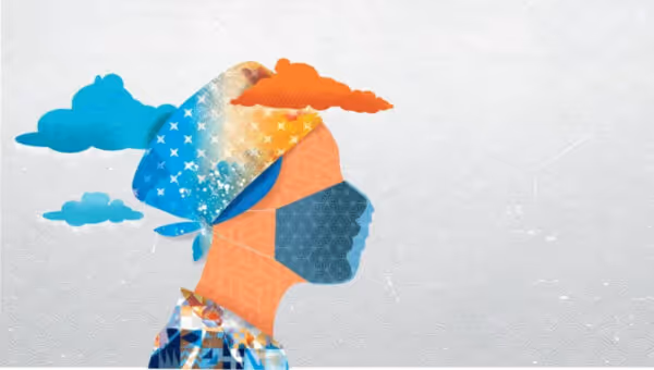
The re-branding of our hospital was a two-year endeavor. The new logo was a real team effort, that combines the historic nature of our geography — our ties to Native American heritage — and Swiss-modern influence. Inclusivity was a key factor in the design process and our CEO, Gary Herbst, ensured full transparency with staff during all steps of the rebrand.
The “K” in Kaweah (meaning crow in Native Yokut Tribe language) was created from the wings of a bird, and the gradient symbolizes the coming together of medical (blue) with humanity (orange).

Was it a collaborative effort with the team, or were you given total creative freedom to carry out your vision?
It was a long process that was complicated by the pandemic, however, with the events of COVID-19 and the focus on healthcare with front-line workers and the toll it took staff, their families and our community, the board decided along with our leadership that now was the most powerful time to have a rebirth. To give hope and show that we are: “More than medicine. We are life.”
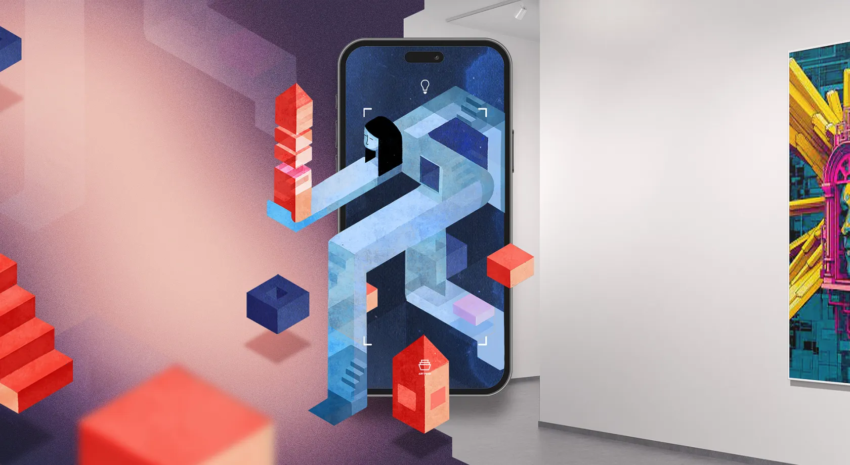
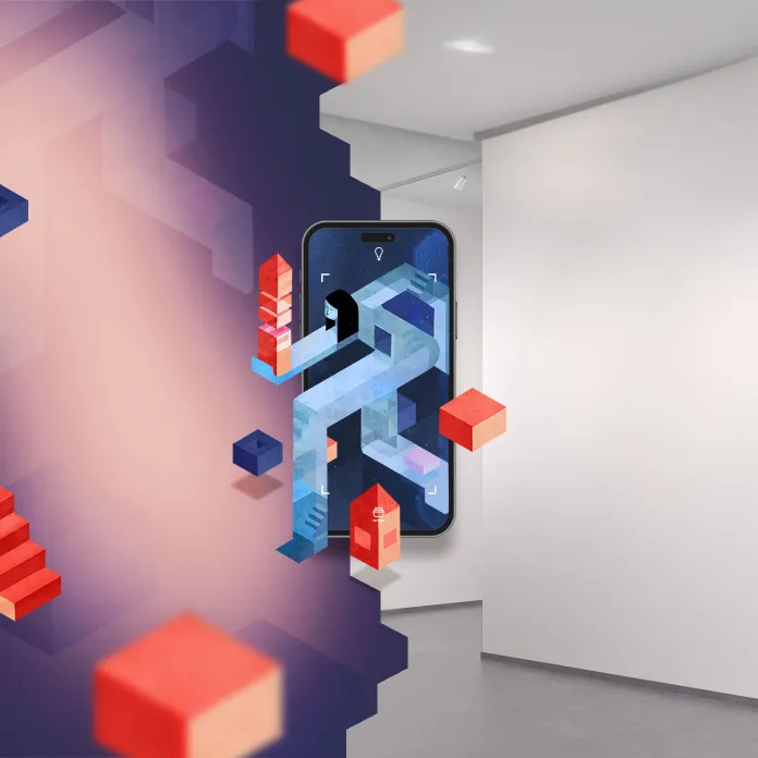
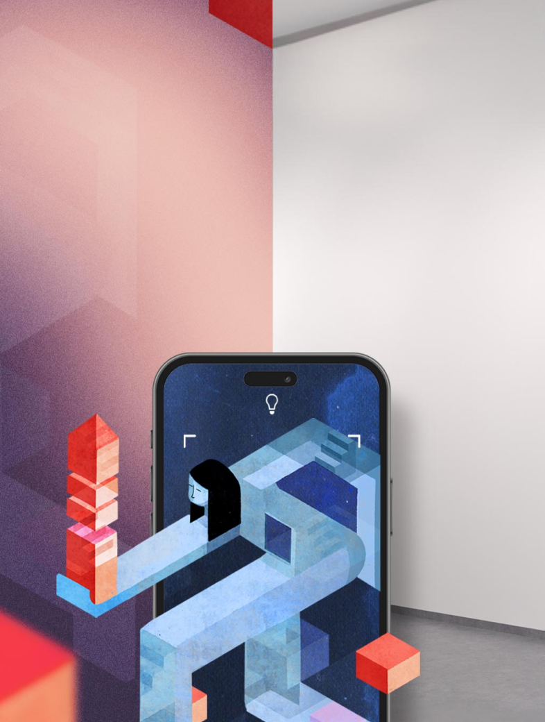
Our small but mighty marketing team bought into the crazy idea of murals, and augmented reality (even if they didn’t understand it). We had total creative freedom because we had embarked on technology that no one had seen or knew how it worked.
Was AR a secondary thought or was it the plan all along to give all the different elements another layer?
AR was my second thought. Initially I was looking into projection art. Casting an image on the hospital building and creating and interactive community event to come watch. The pandemic made us reevaluate, since we could no longer gather. That’s when I thought about AR. I had designed a few things with Aero and they were fun, but Artivive allowed me to deliver it to the masses in an easy-to-use format.
I have long been an Adobe user. I started in college with Illustrator 88 — I hope that doesn’t age me too much. I often attend Adobe Max and in 2018-19, I was introduced to the world of AR through Aero. It’s an amazing program and I knew we had to use it with the rebrand. One late night during the pandemic when I was creating another masking flyer I happened upon Artivive. It was the perfect vehicle for my vision, but I needed proof of concept.
We had a cardiac unit celebration in February that celebrates Heart Month and cardiovascular awareness. As a gift to the unit, I created 12 art pieces that highlight staff and celebrate them, to be displayed in the cardiac unit hallway. I put them up and created a poster (a small art gallery) and waited to see if it would work for the rebrand. HUGE! Success! Everyone loved it. It was immersive, fun, full of life, and memorable. All the things I wanted for our rebrand.
Where did you get the inspiration for the various artworks you put together? The style is very distinctive and it feels like you really had a vision you were working towards.
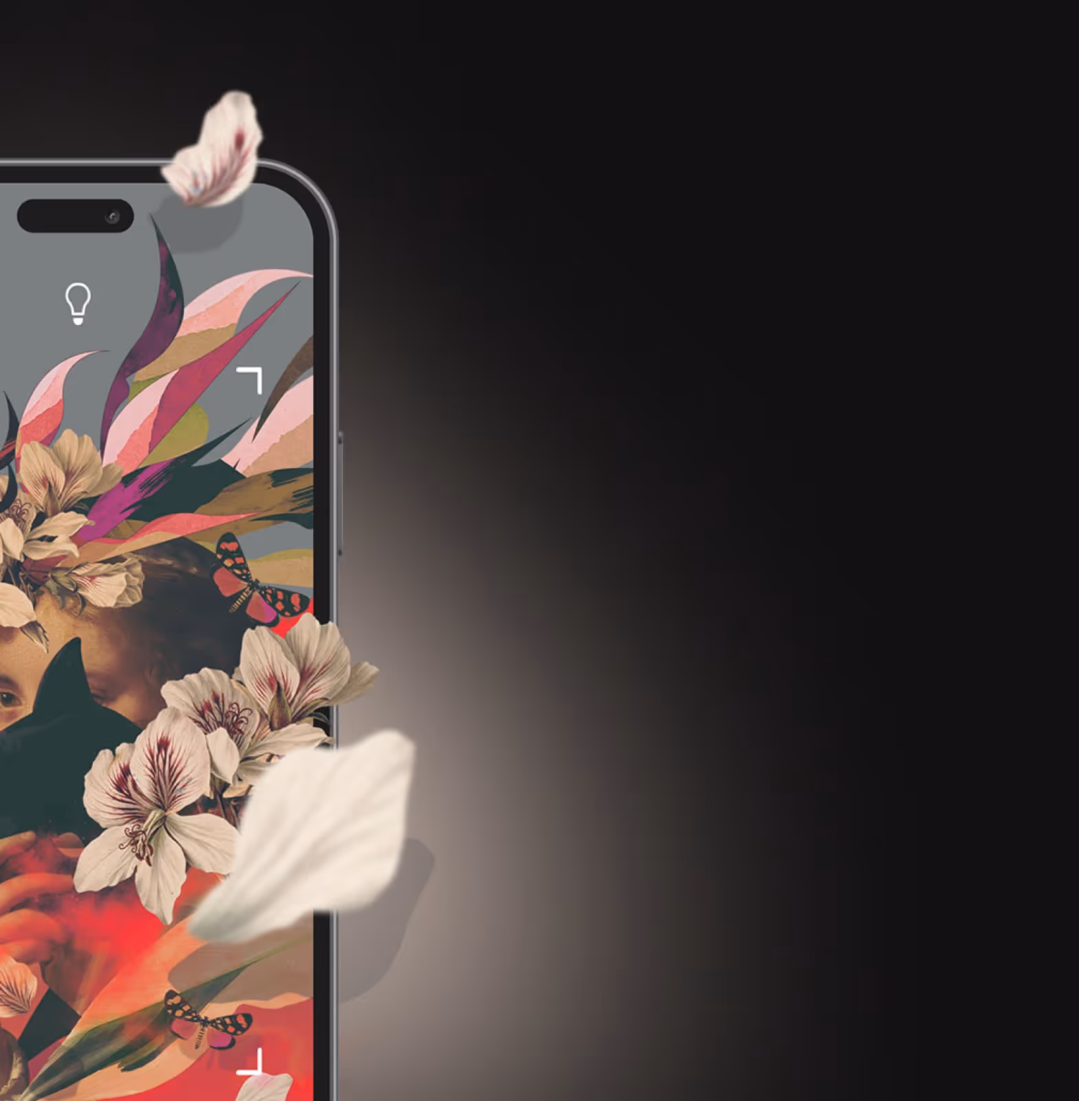
The inspiration came from Shepard Fairey and Eric Carle — I loved those books for my sons. I wanted images that were vibrant and would leave you with a positive feeling. Healthcare often looks like an insurance ad. This art was a huge risk. I’ve never seen a health care system be artistically driven.
I was glad I had used the cardiac event to learn some of the few limitations — don’t use a logo or repeating elements on the activation art. Knowing that it was going to be AR complicates the design process and stretches your creativity into a 4th dimension.
To push the creative envelope even further, I wanted to create a commercial that used AR as well. We had around 40 days to create a commercial, which is yet another thing that had not be done in our area before. With a super small budget, we set out along with Windsong to show the creativity of our new health care brand.
There’s one piece in particular that stood out to us — the one that celebrates healthcare professionals, with the focus on “The Year of the Nurse” — it’s such a beautiful piece with such a powerful message. Can you tell us a bit about it?
The national theme in the US this year is “The Year of The Nurse”, which is appropriate. They were on the front lines and worked so hard, and sacrificed so much during the pandemic. We had nurses that lived in trailers outside their homes because they didn’t want to interact with their families as a precautions of being in contact with Covid patients. I created the artwork based on the same style as the rebranding, but even though it was abstract, I felt it needed more diversity. I decided to use AR to illustrate that diversity and to celebrate their year. We created a cup with an AR activated message of celebration and diversity. It has been well received.
Intested in finding out more on AR Murals and how to create them?
Get the Artivive App
Tap into new Dimensions